Overview
Creative Printing’s homepage needed to do more than introduce the shop. It had to help customers start the right kind of order: copy and print, business cards, envelopes, wide format, signage, multimedia conversions, website work, or general service questions.
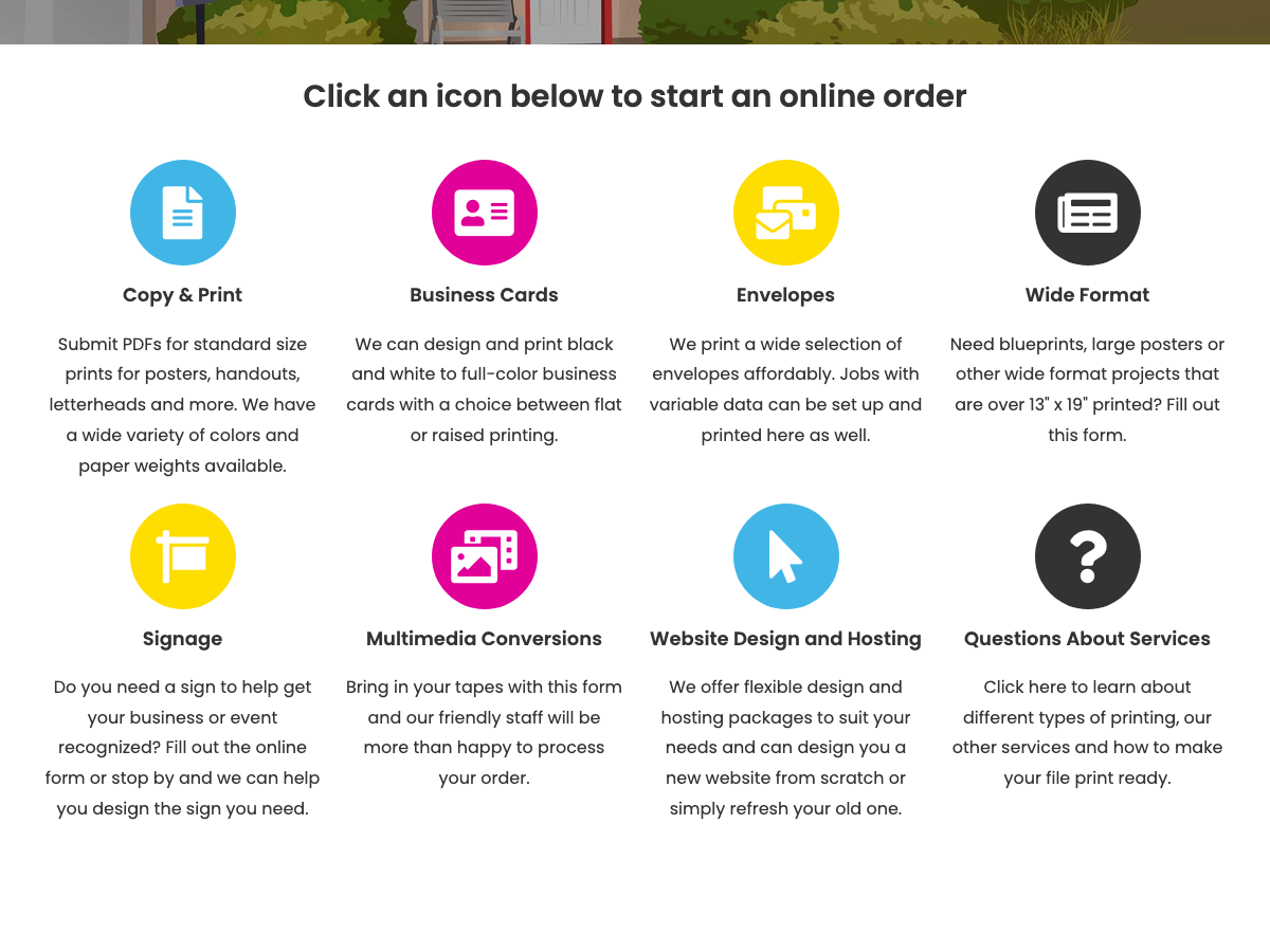
I redesigned and built the order entry experience around a simple question: what are you trying to make? The homepage moved from broad service browsing toward a direct category grid that sent customers into the right intake path.
- Problem
- Customers needed a faster way to choose the right order path.
- Primary users
- Local customers ordering print, signs, multimedia, or website services.
- Design move
- Surface the main order categories as large icon-grid entry points.
- Result
- The category grid shipped as the homepage entry point for every service path, and still anchors the live site.
The Friction in the Flow
Customers often arrived with a specific job in mind, but print work spans different mental models. A business card order, a sign request, and a website refresh do not need the same questions or the same next step.
The order path needed to solve three practical problems:
- Different service types. Printing, signs, multimedia, and websites each needed a distinct entry point.
- Fast recognition. Customers needed to see their job type before reading through service pages.
- Mobile access. The order entry points had to be usable from small screens, not only from the desktop navigation.
Refactoring the Information Architecture
I restructured the homepage around the “Order Now” moment. Instead of forcing customers to choose from navigation menus first, the page introduces a large icon grid with the main job categories.
The categories use plain service names customers already understand: “Copy & Print,” “Business Cards,” “Envelopes,” “Wide Format,” “Signage,” “Multimedia Conversions,” “Website Design and Hosting,” and “Questions About Services.” Each tile acts as a decision point, moving customers toward the relevant service page or intake form.
Responsive Design and Implementation
I built the homepage and order grid to work across screen sizes, with large visual targets and clear labels. The interaction stayed intentionally simple: find the closest category, select it, and continue into the appropriate service path.
The interface keeps the main service paths visible before customers commit to a form, so picking the wrong category costs one step back rather than a restart.
Outcomes
The redesigned order path shipped on Creative Printing’s homepage, giving customers a direct route from recognizing their job type to the right intake form. Years later, the grid still anchors the live site — structure that held up in daily use, not a one-off concept.